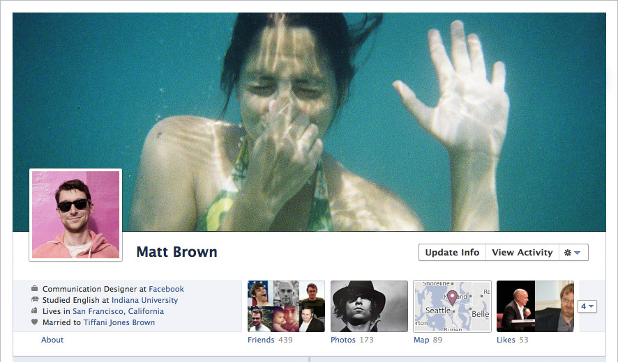
Facebook's Timeline has both fans and detractors, which is to be expected of any new major UI upgrades. After all, some will find it pretty and useful, while some will just want to keep on using the old look being more comfortable with it. No matter what your personal preference may be though, for your business pages, you have to set aside your personal biases and use whichever look will benefit your business the most.
Mashable's article wherein they used data from eye-tracking group EyeTrackShop to compare visual statistics from Facebook, Twitter, and MySpace, as well as compare the old Facebook and the timeline version, showed some interesting points in favor of using timeline. These three include the following facts:
- Facebook Timeline cover photos get noticed first
- Facebook ads get noticed more in Facebook Timeline
- Personal information such as employer and location gets more attention in the new Facebook Timeline
As you can see, using timeline on your page can help you leverage certain things you want to get noticed more. Since cover photos get notices first on the timeline version (Not surprising with it occupying such a huge amount of space), it makes sense to put up your company logo and whatever special product/service/event/promotion you are pushing for at the moment in that space. Of course, you'll have to be creative about it, because putting up something really boring and amateurish as cover photo will mean that the poor quality will also get noticed first as well. With the info page also getting more attention, this means that it is important that you really fill out those fields and squeeze in as much information as you can.
Last, but not least, with ads getting noticed more in timeline, and with more people shifting to the timeline version each day, this means that it would be a good idea to start looking into investing more money into your Facebook ads.
Image via Facebook – Introducing Timeline Page
